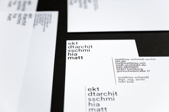
topsy-turvy type
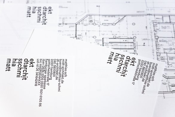
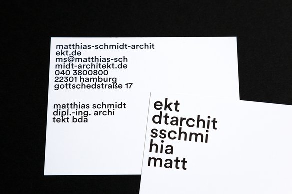
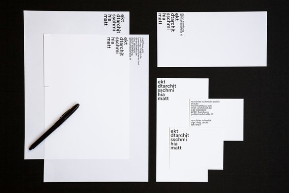
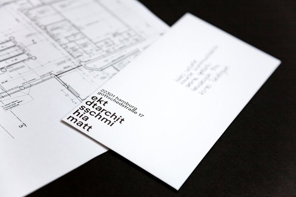
this wordmark disobeys typographic rules, disdains readability, and disrupts the way our eyes habitually see things. everything is upside down and the wrong way round, the text reads in the wrong direction and the wraps look random. yet the structure, the building, is a picture of stability. which is precisely what architect matthias schmidt wanted: a perfectly balanced typographic composition, striking, extravagant and free-standing. simple as that.
projectdata
place:
hamburg
year:
2021
client:
matthias schmidt architekt
communication design:
büro uebele
visuelle kommunikation
project team:
selina gerlach (project manager since 09 2021)
lorenz grohmann (project manager until 09 2021)
carolin himmel
andreas uebele
photos:
selina gerlach
principle typeface:
circular pro